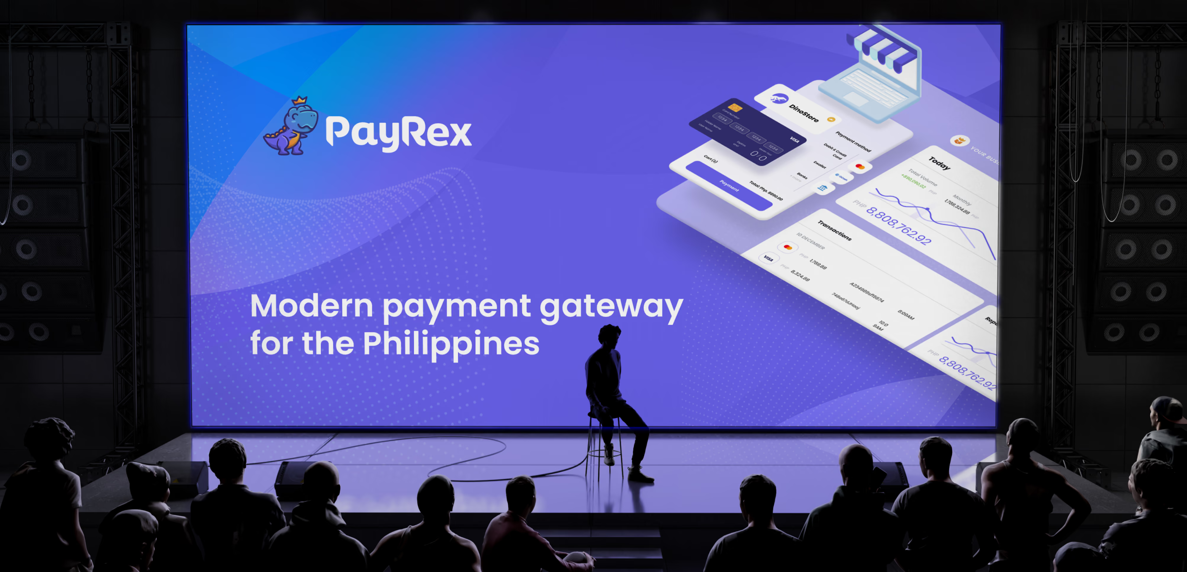
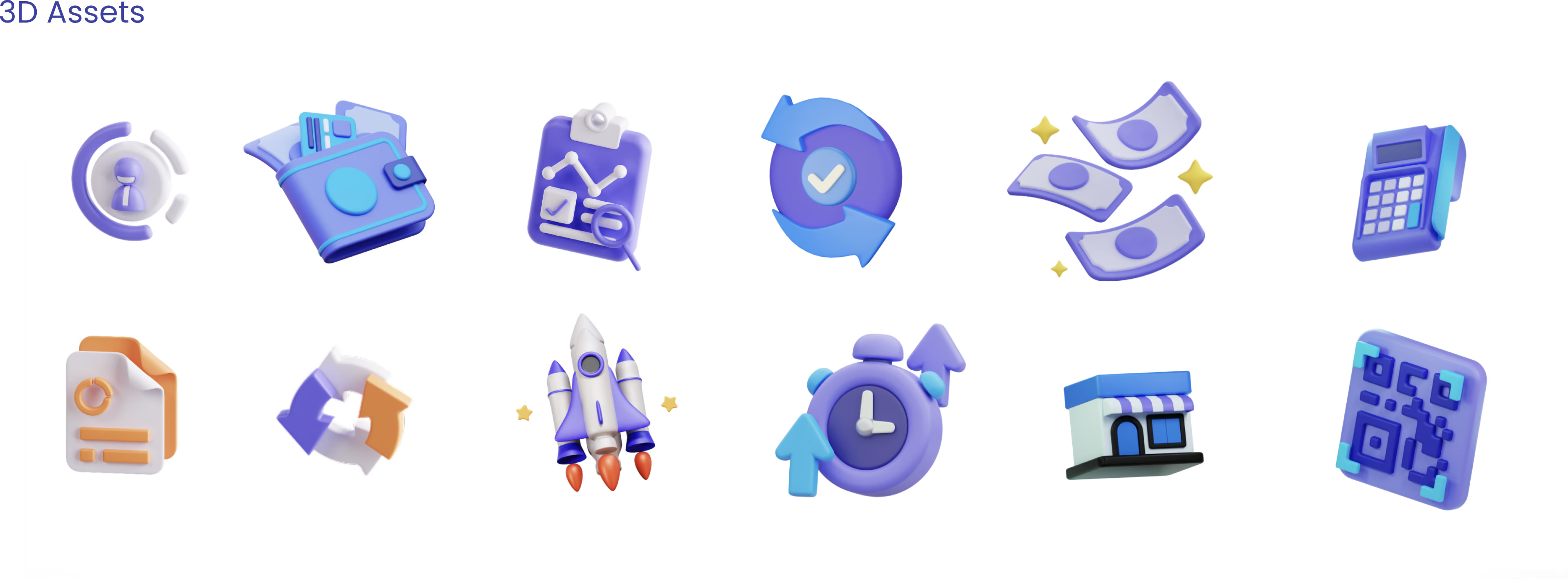
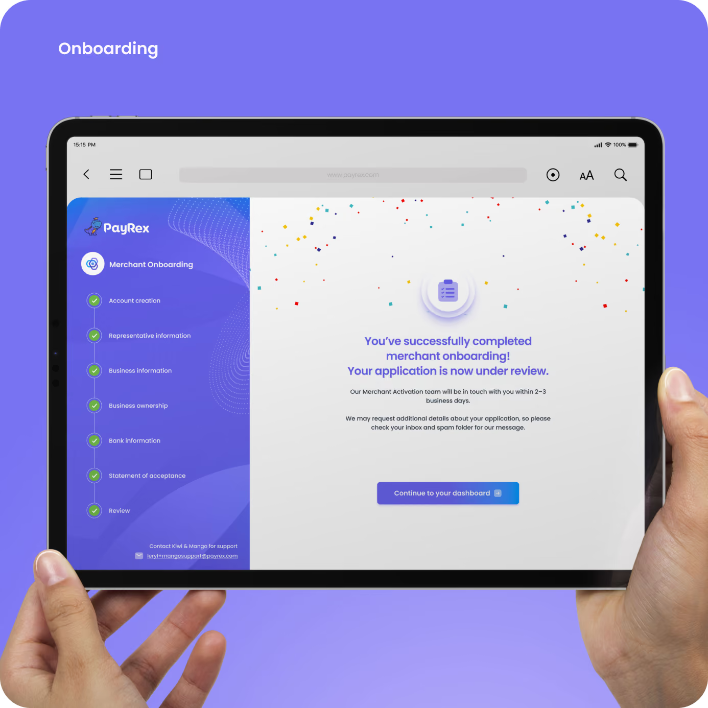
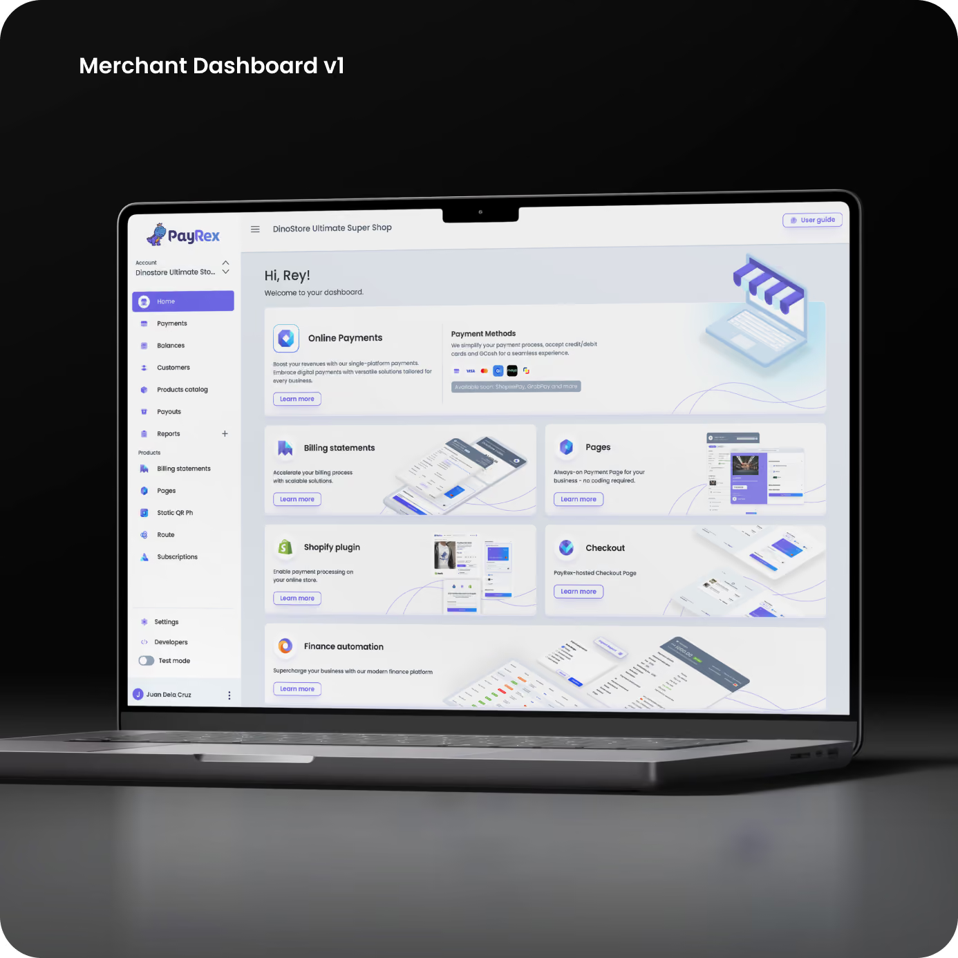
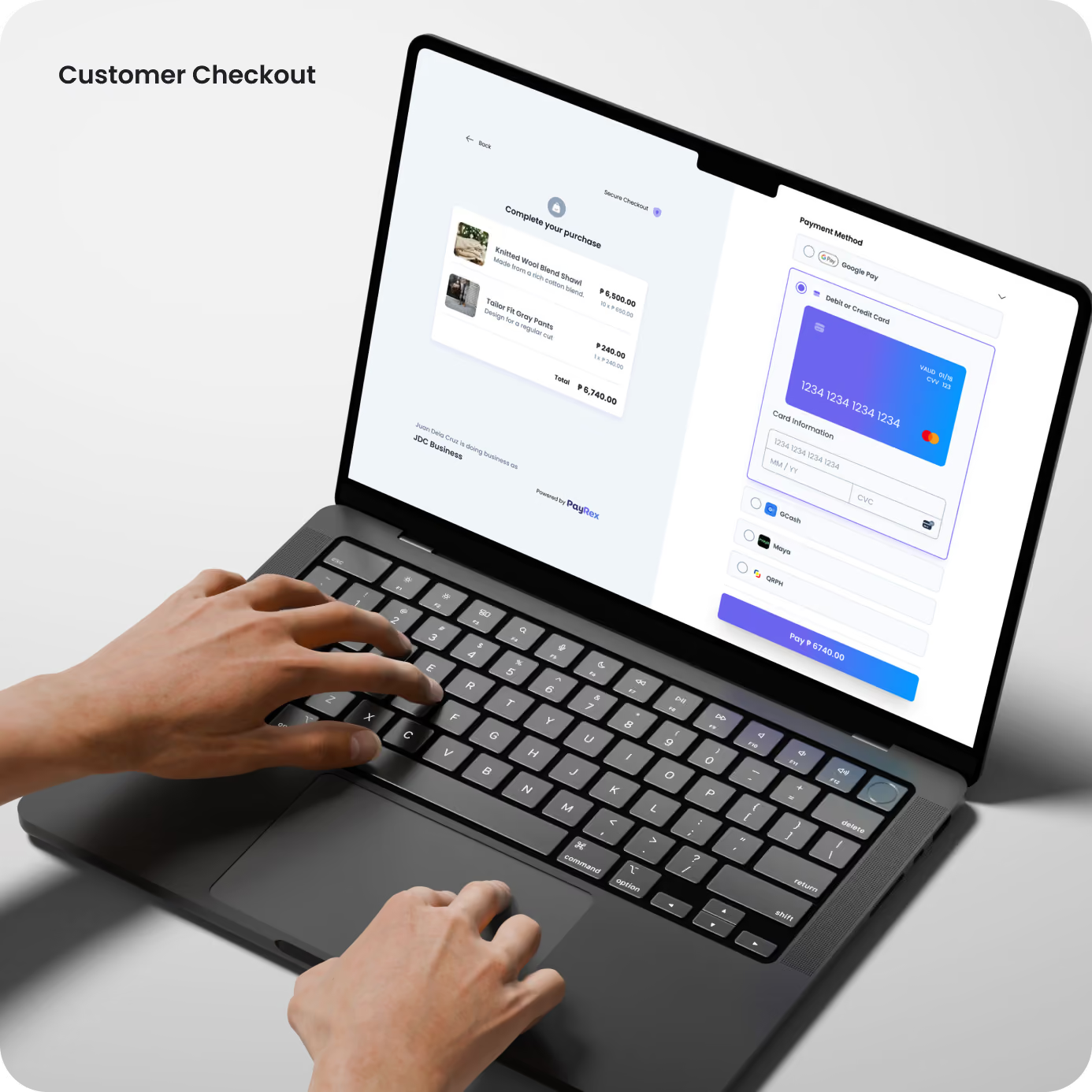
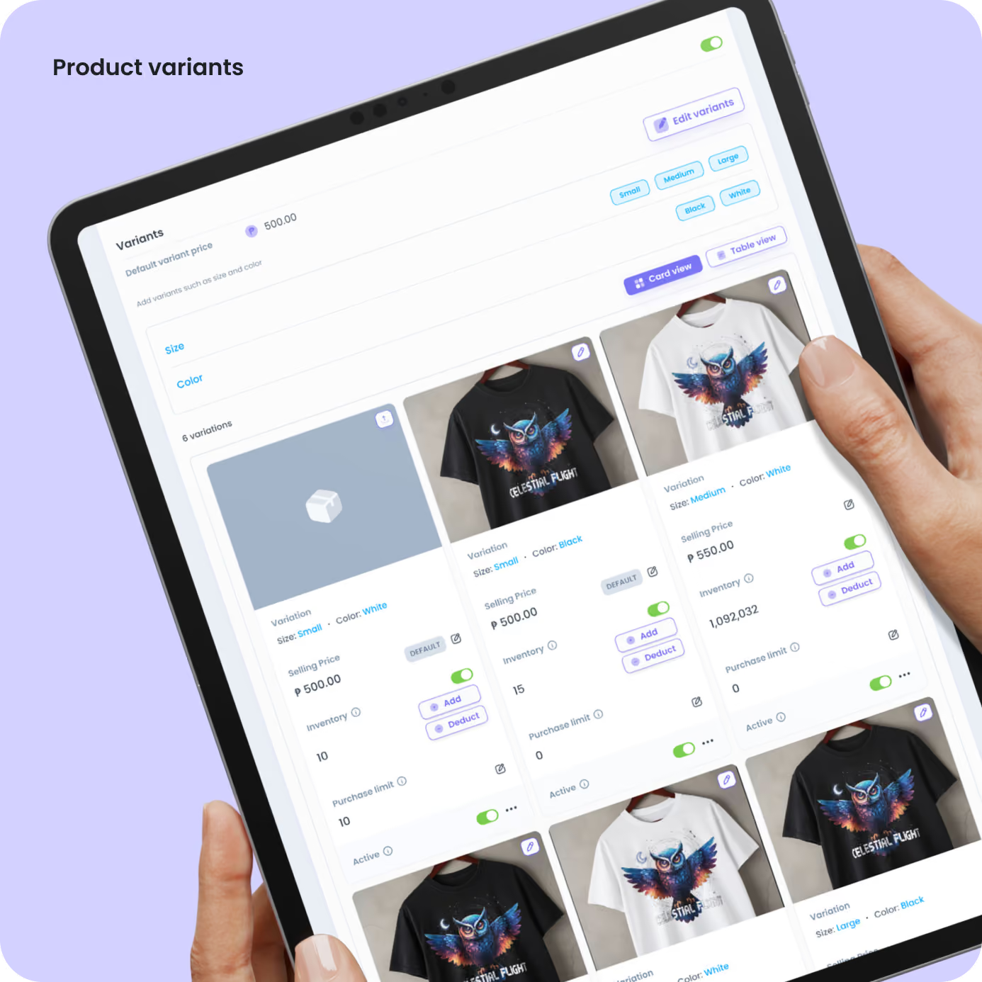
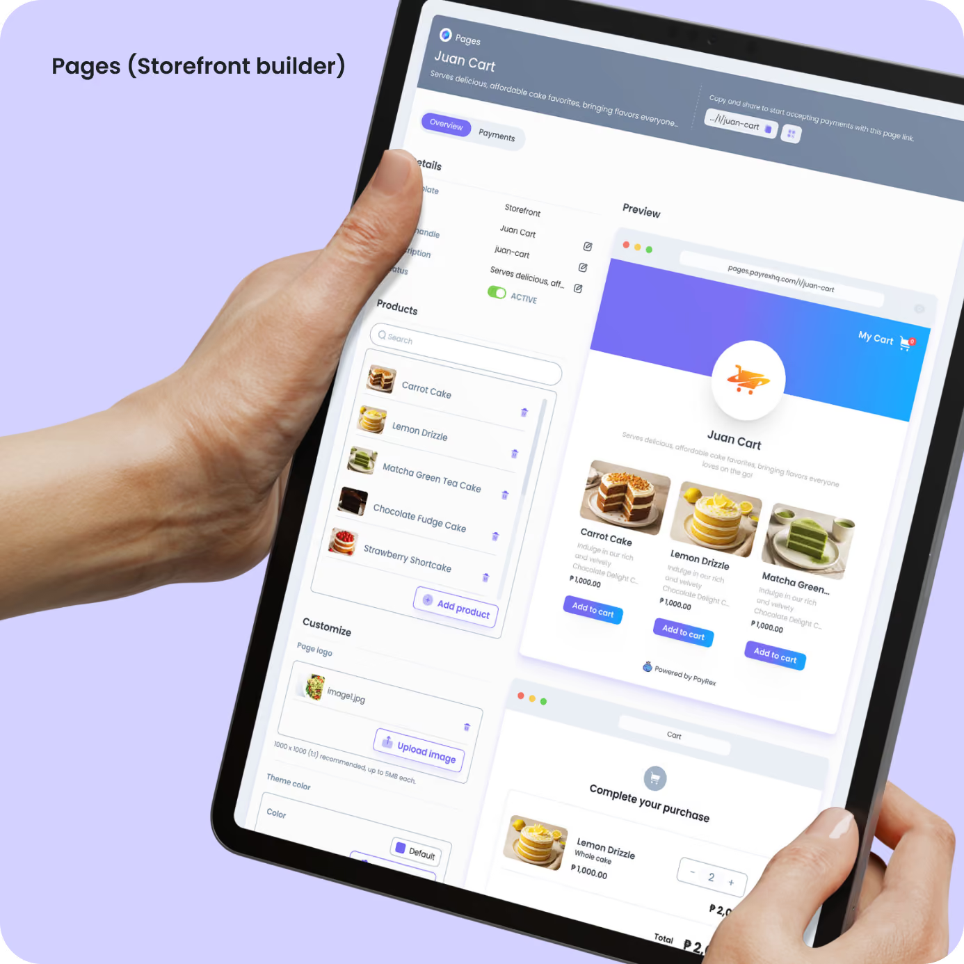
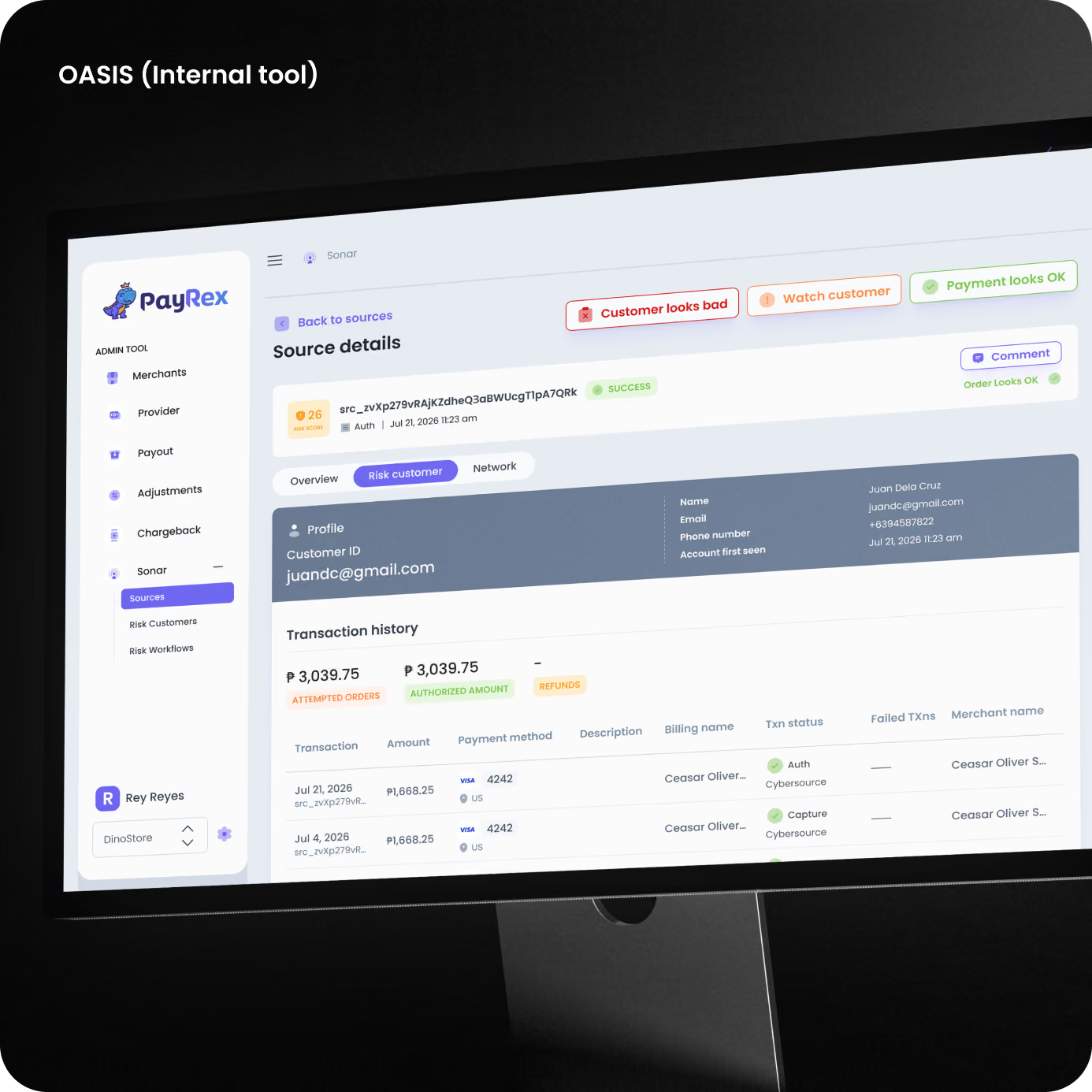
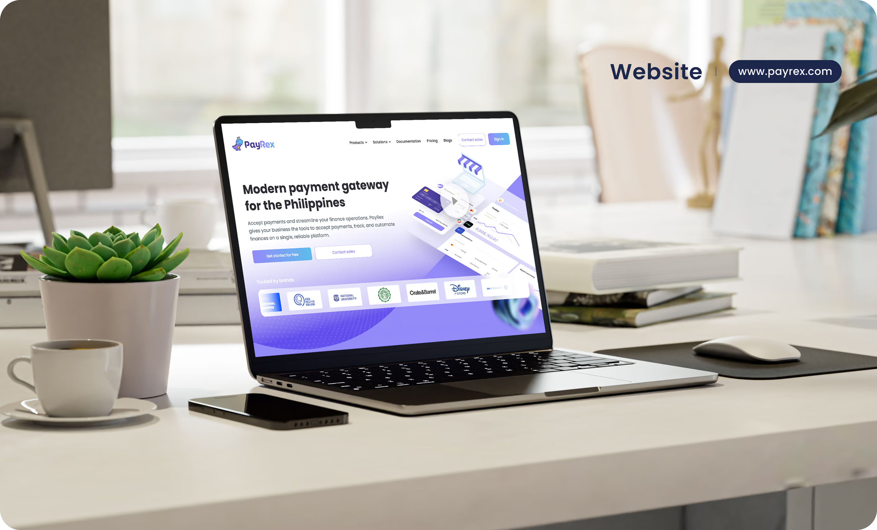
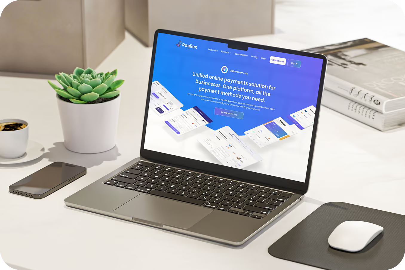
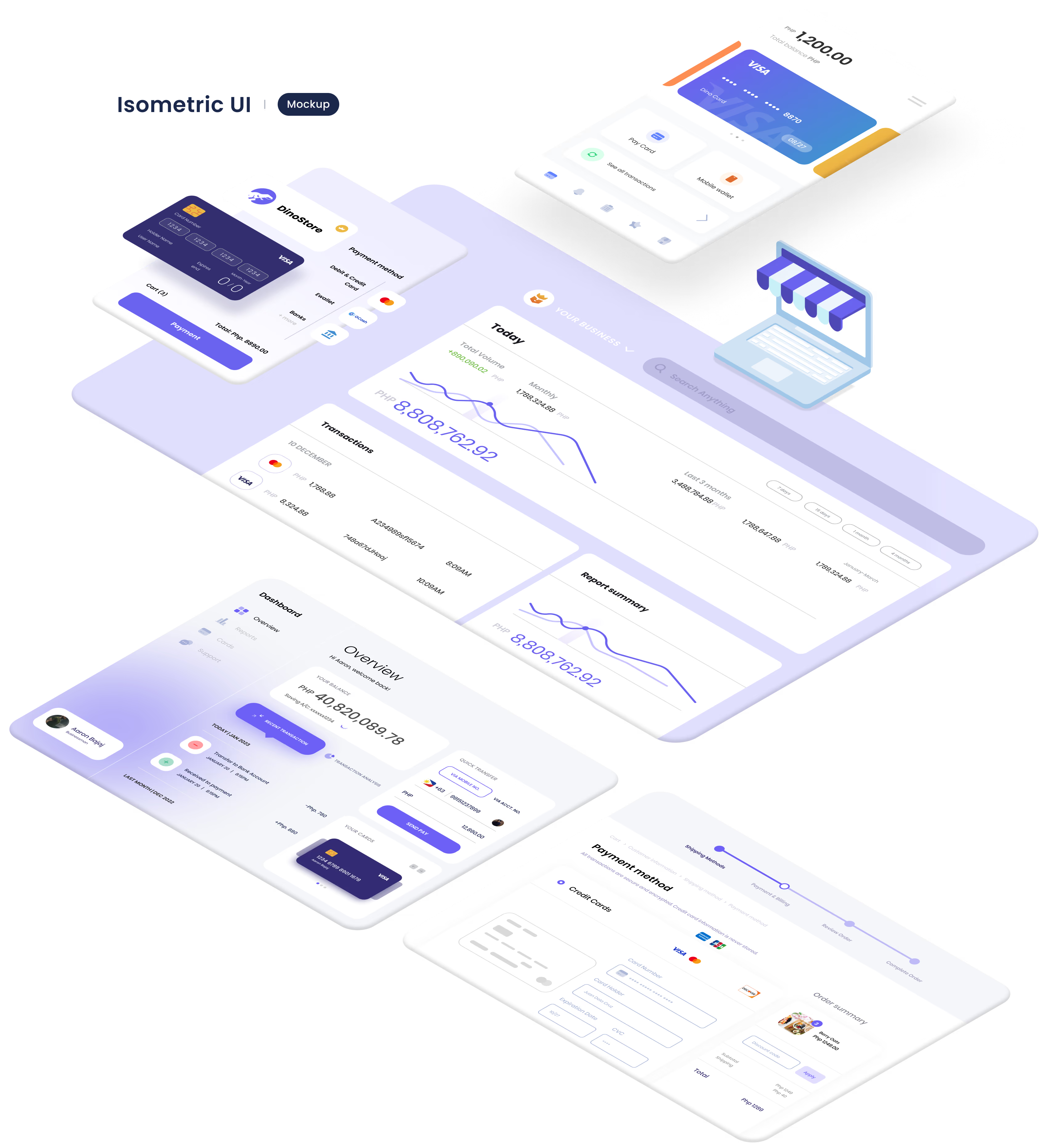
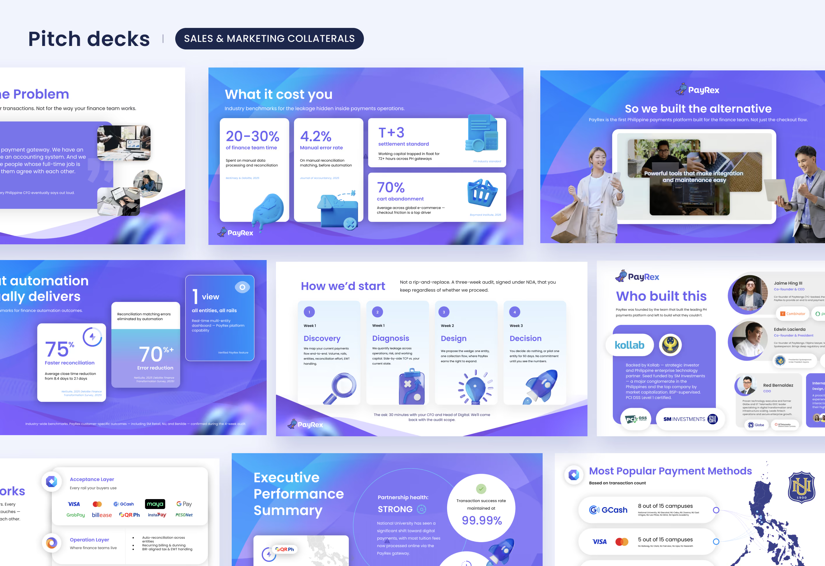
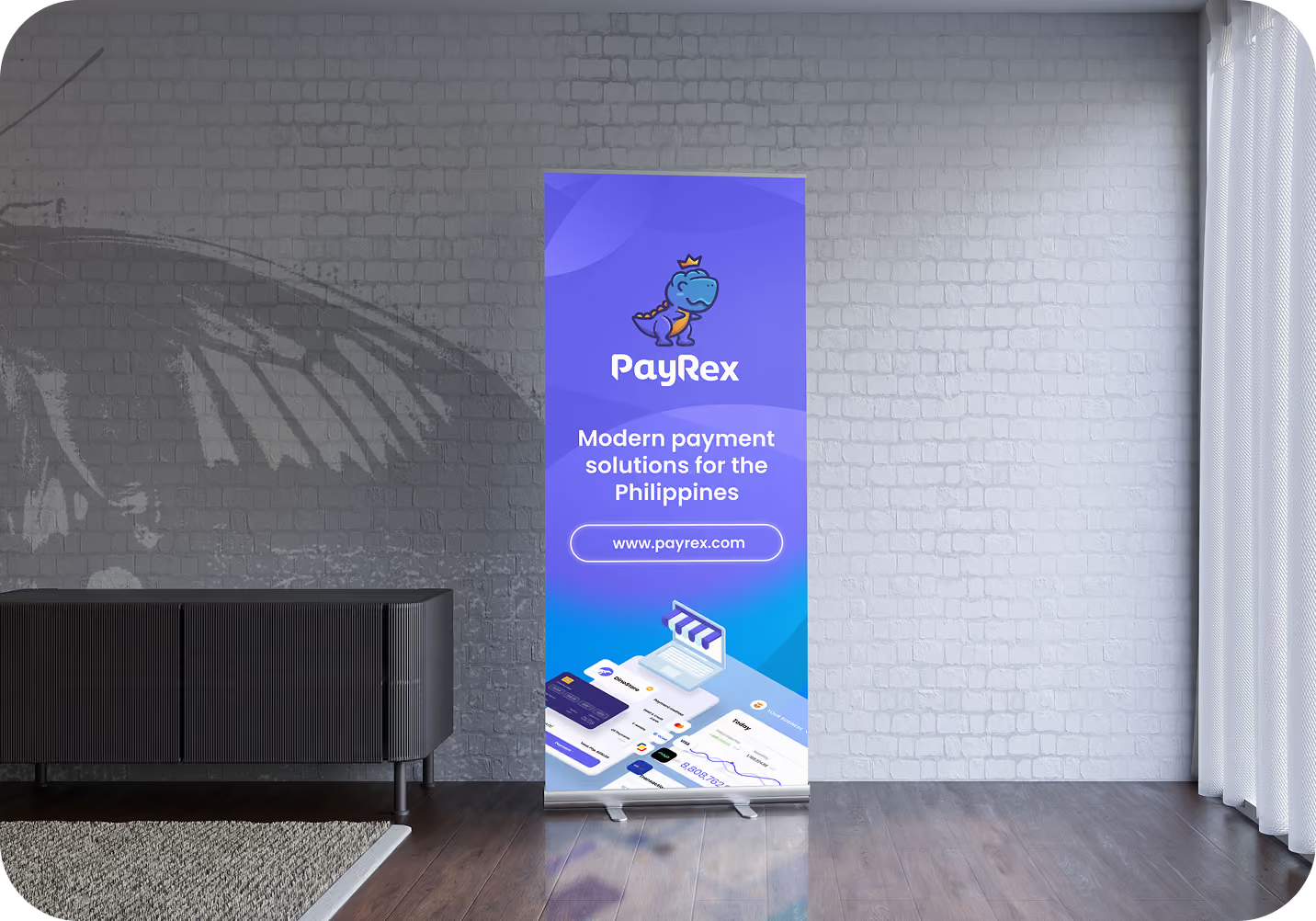
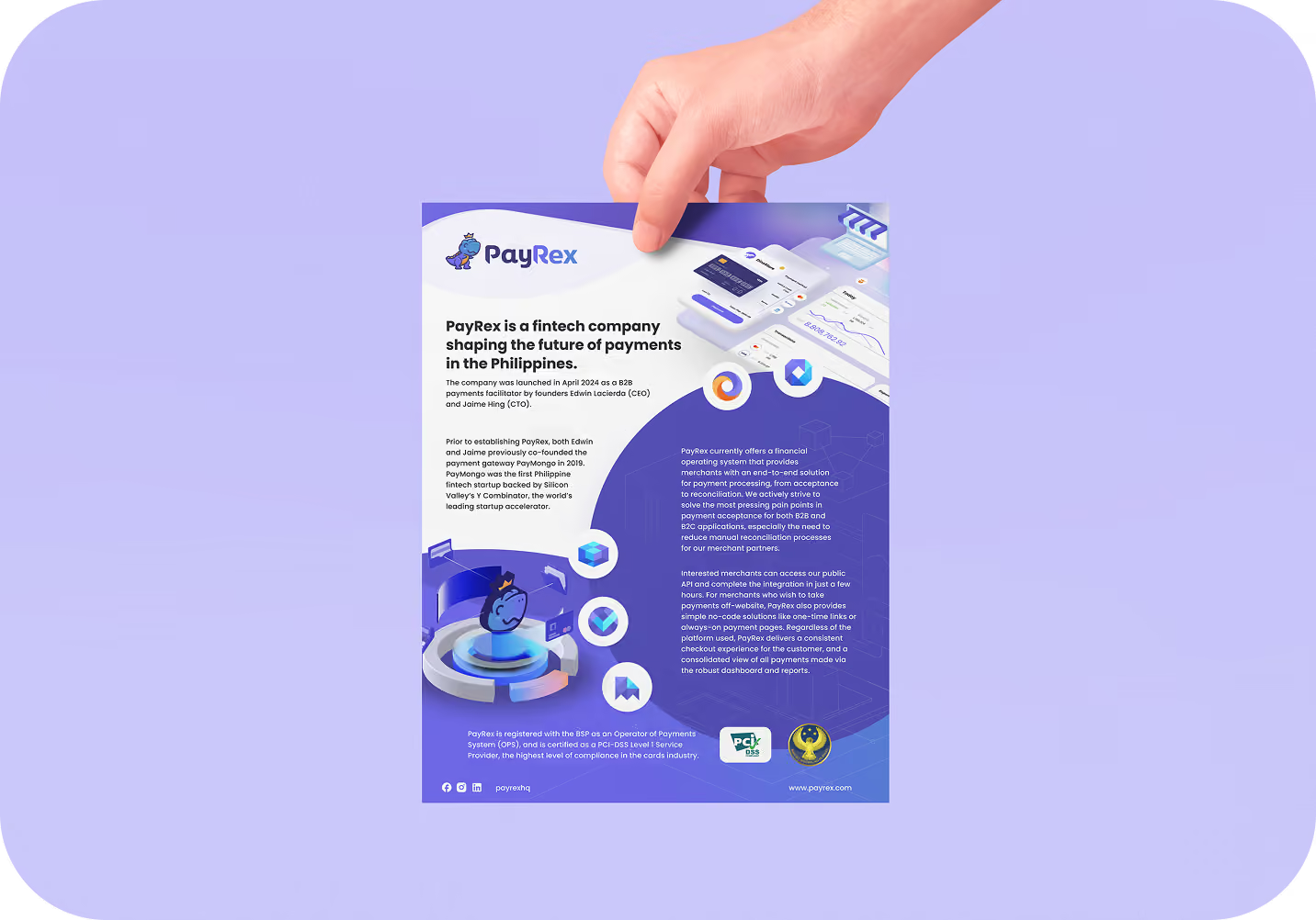
PayRex is a Philippine payment processor. When the engagement started, the name “PayRex” existed, but nothing else. There was no brand identity, the product was still under development without any designs, and there was zero market presence. Over the following years, acting as a designer-engineer and the team's solo designer, I built the brand identity from scratch spanning the logo, iconography, 3D assets, and visual language alongside a complete design system. I also designed the product experience across the merchant dashboard, the customer-facing checkout, and OASIS (the internal tool used by PayRex’s onboarding, finance, and risk teams). Finally, I handled the marketing surface area, including the website, product video, pitch decks, social media assets, and blog content designed to introduce PayRex to the market.
PayRex was entering a category where trust is the product. Philippine businesses already had established options like Xendit, PayMongo, Maya Business, Dragonpay, and Paynamics; each with years of market presence and brand recognition that PayRex lacked entirely. The goal wasn’t just to look credible; it was to earn brand awareness, prove genuine usefulness to merchants, and back that up with a product experience good enough to keep them. My job was to build every surface where a business would form its first and lasting impressions: identity and product.
Branding
Logo & Visual Identity
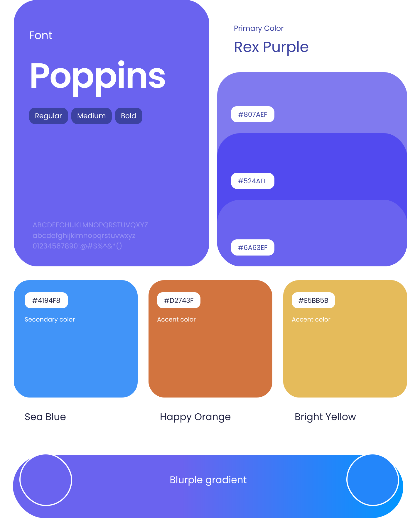
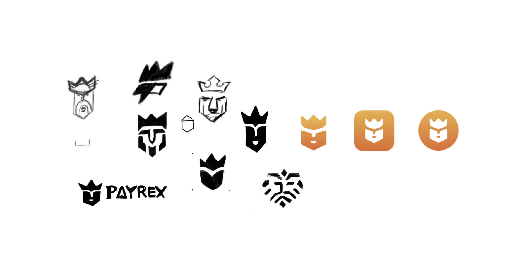
The logo is one of a company’s most distinct assets, which is why it served as the foundational starting point for the PayRex branding project. This phase also marked the beginning of defining the brand's strategic market positioning. My creative process involves gathering inspiration from various sources and aligning them with the stakeholder vision. The name PayRex is a combination of two concepts: Pay (referencing payments) and Rex (Latin for "king," while also referencing the Tyrannosaurus Rex, meaning "tyrant lizard king"). Building on these pillars, I explored various design studies inspired by royalty, crowns, the T-Rex, lions, the letter 'P', and custom typography. For the color palette, I chose purple as the primary color to represent power, wealth, transformation, harmony, and creativity, paired with a blue accent to evoke security, reliability, and professionalism. Touches of orange and yellow were integrated to introduce a sense of warmth and approachability.
Study 01

Inspiration
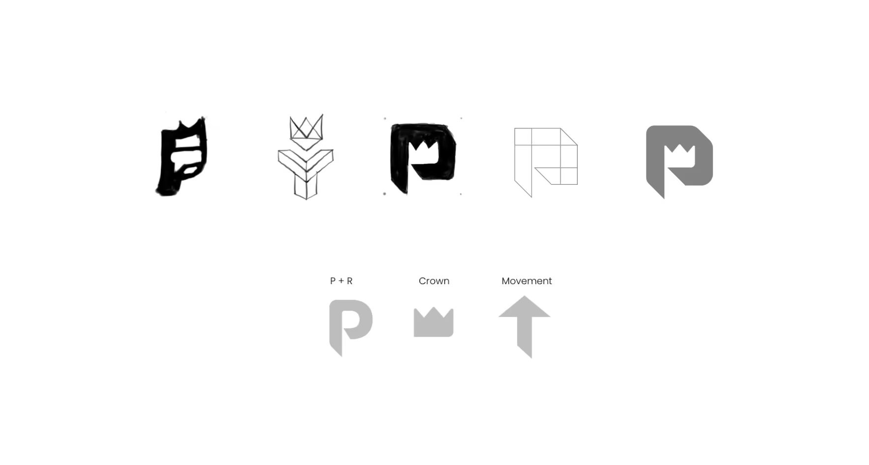
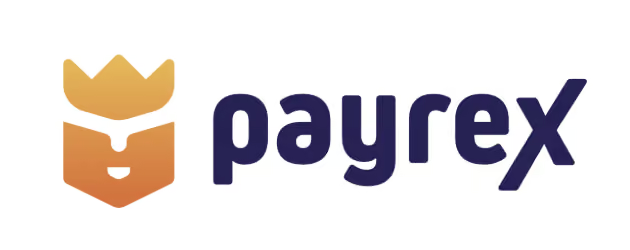
A simple and straightforward icon that cleverly merges the acronym letters P and R, using negative space to form a crown that represents "Rex" (king) and symbolizes power, leadership, strength, excellence, and success in the financial industry. Integrated within the design is a bill or money motif to signify finance, alongside an arrow that symbolizes forward movement, all anchored by a bold and friendly wordmark.
Study 02
Inspiration
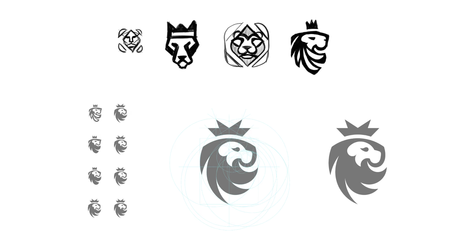
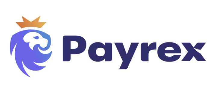
The logo draws core meaning from four powerful symbols: the lion embodies strength, nobility, courage, and resilience; the crown signifies authority, unity, and financial prosperity; the shield acts as a safeguard providing protection against fraud and threats; and the sun represents strategic direction, clarity, purpose, and hope.
Study 03
Inspiration
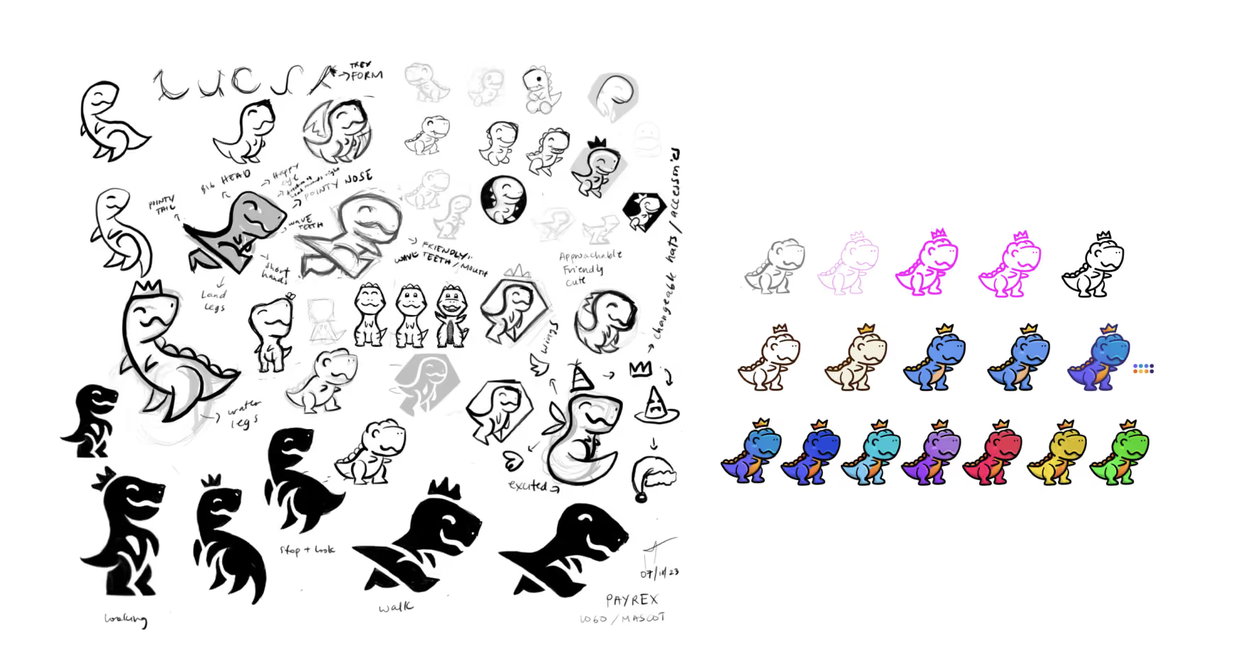
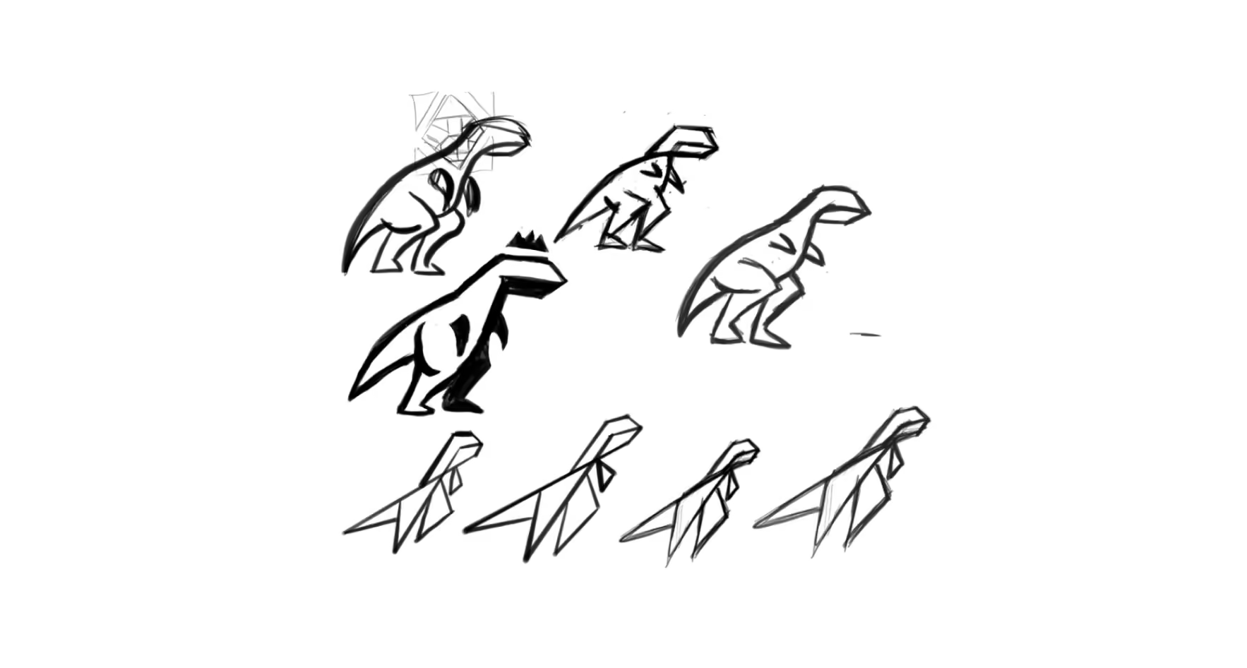
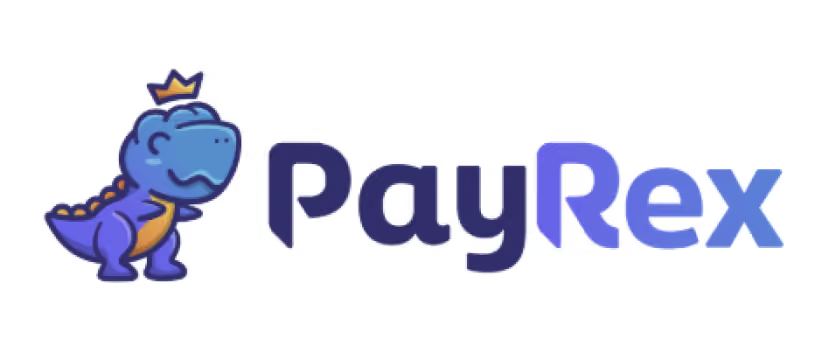
Drawing inspiration from the T-Rex (the king of dinosaurs). The logo embodies strength, agility, and power, while incorporating a crown to symbolize authority, unity, and financial prosperity through a friendly, approachable, and mascot-style aesthetic.
Inspiration
The logo is inspired by royals. It symbolizes rule and power while the Lily crown symbolizes new growth and beginning.
Inspiration
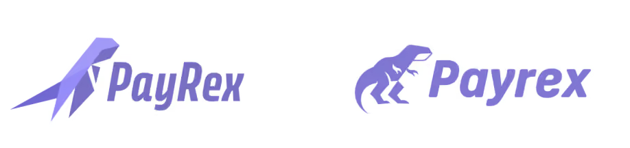
Another logo is inspired by the dinosaur T-Rex. The king of all dinosaurs. It embodies strength, agility and power. Study 5 is a low poly design T-Rex, a simple and minimalist design logo while study 6 is a silhouette of a dinosaur.
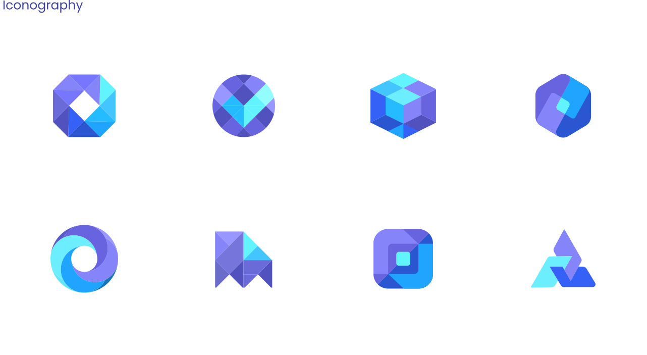
Out of the proposed concepts, the stakeholders selected the third design: a cute, fun, and approachable mascot logo featuring a T-Rex wearing a crown, later named "Rexter." This direction was chosen to position the brand as friendly, accessible, and reliable; mirroring a product experience defined by ease of use and exceptional customer support. Following the logo approval, I developed the complete visual identity system, including logo variations, color palettes, typography, iconography, and supporting visual assets. To ensure consistency across all internal and external channels, I also authored a comprehensive brand guidelines manual.
Product experience
Design System, Merchant Dashboard, Customer Checkout & OASIS
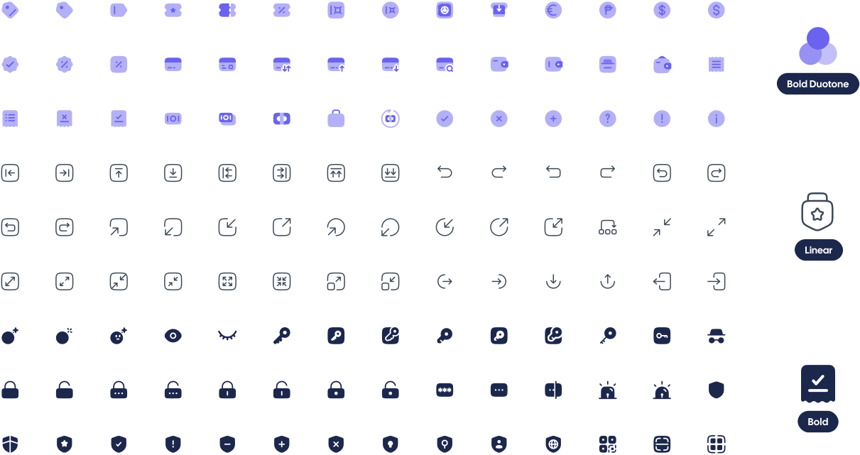
A collection of 3,414 unique icons covering a wide range of themes and purposes, giving developers a versatile, extensive visual language for any interface they're building.
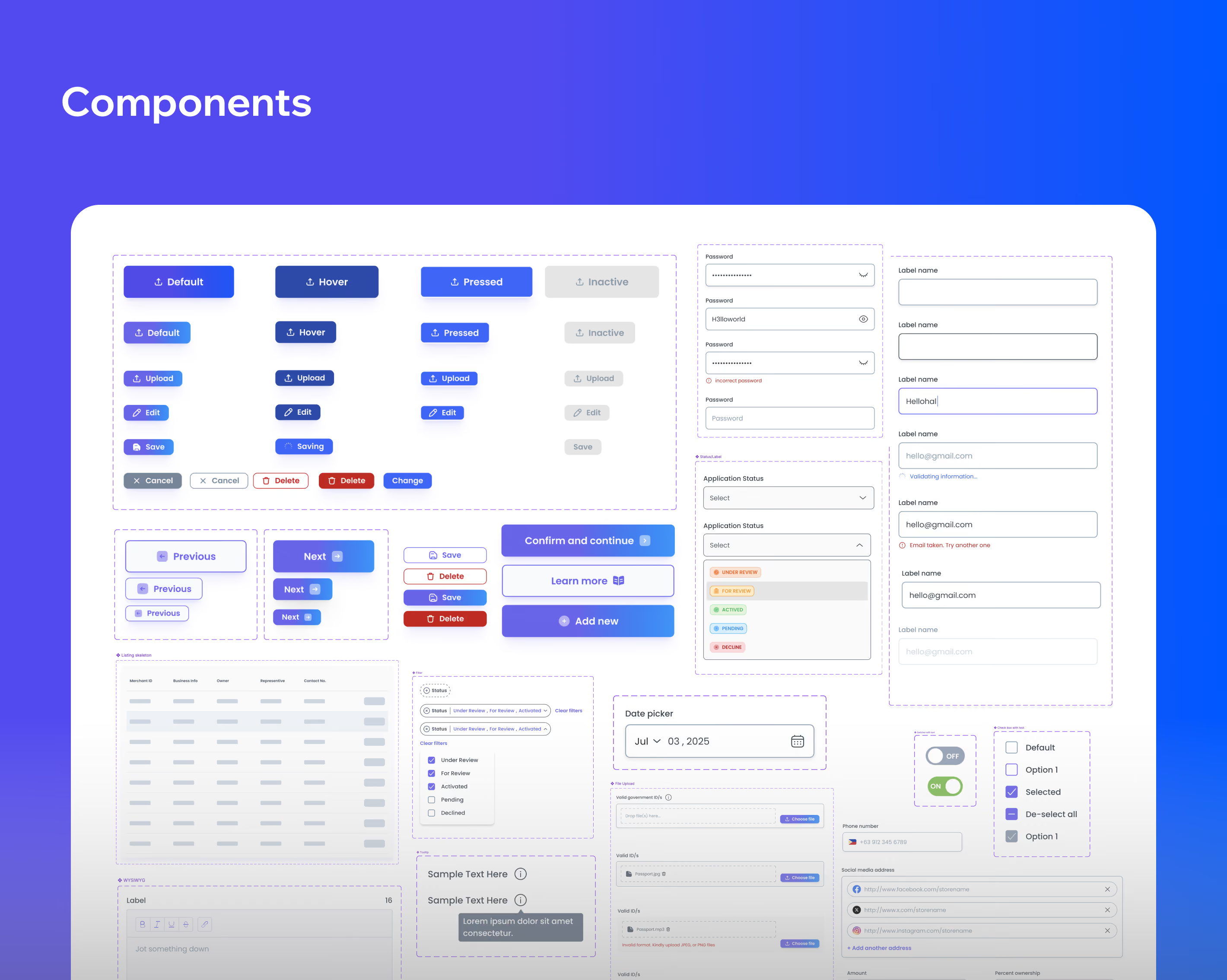
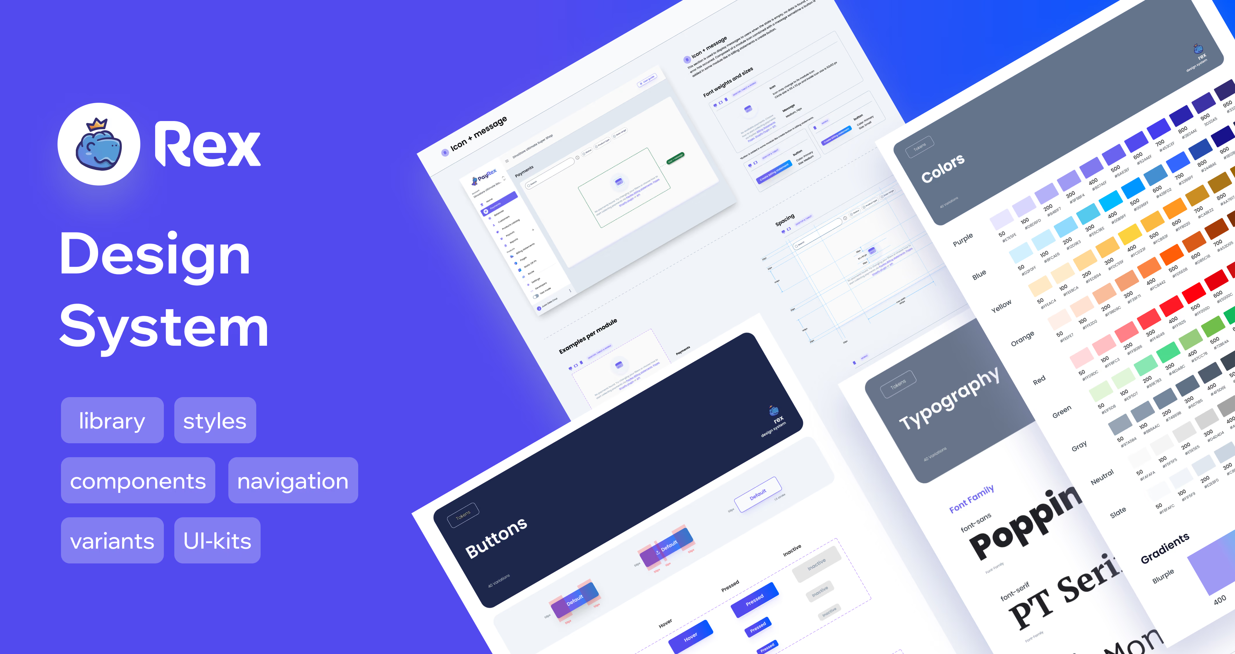
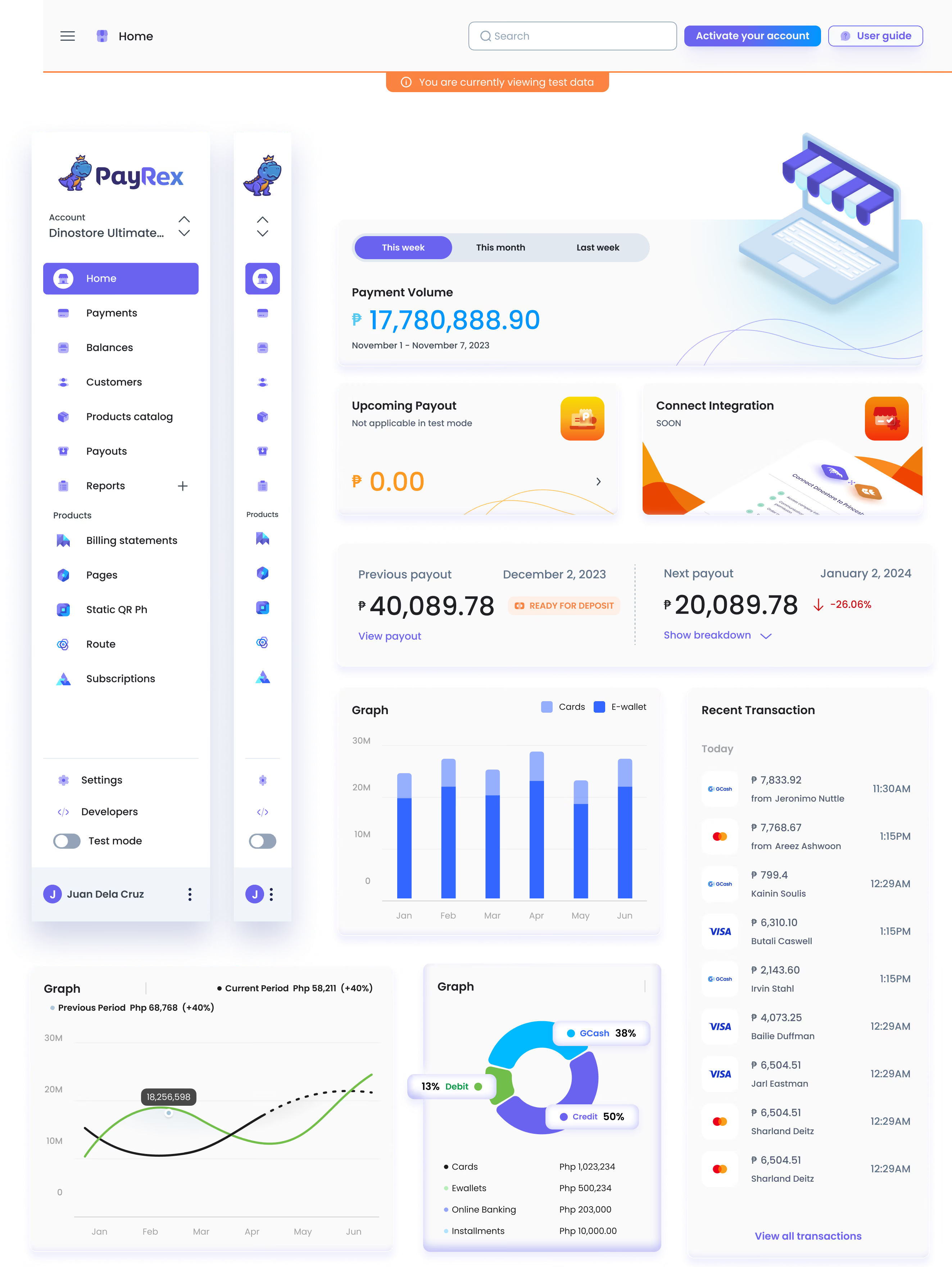
Rex design system boasts a comprehensive library of 3,671 UI components buttons, cards, tables, charts, and navigation patterns. These are the same building blocks used to power the live PayRex merchant dashboard, giving developers a versatile, extensive visual language for any UI/UX scenario.
Marketing & Business Growth
Website, collaterals, pitch decks, product videos, social media content & event videos & photos